Client
Salesforce
Role
Lead Designer
Tools
Figma / Codex
Duration
2025-2026
Designing a Scalable Enterprise Platform: Salesforce Careers 👩🏻💼👨🏻💼
Salesforce Careers website serves a global broad audience—from students exploring their first internship to experienced professionals searching for their next opportunity. The challenge wasn't simply redesigning pages, but establishing a scalable foundation that could simplify navigation, improve content discoverability, strengthen employer branding, and support evolving content over time.
Partnering with creative and content teams, I explored new information architectures and validated navigation concepts through lightweight user testing. I then created reusable UI systems, component/token libraries, and a visual language tailored for Salesforce careers storytelling. I also developed interactive prototypes directly inside Salesforce's enterprise Page Builder to bridge design and implementation.
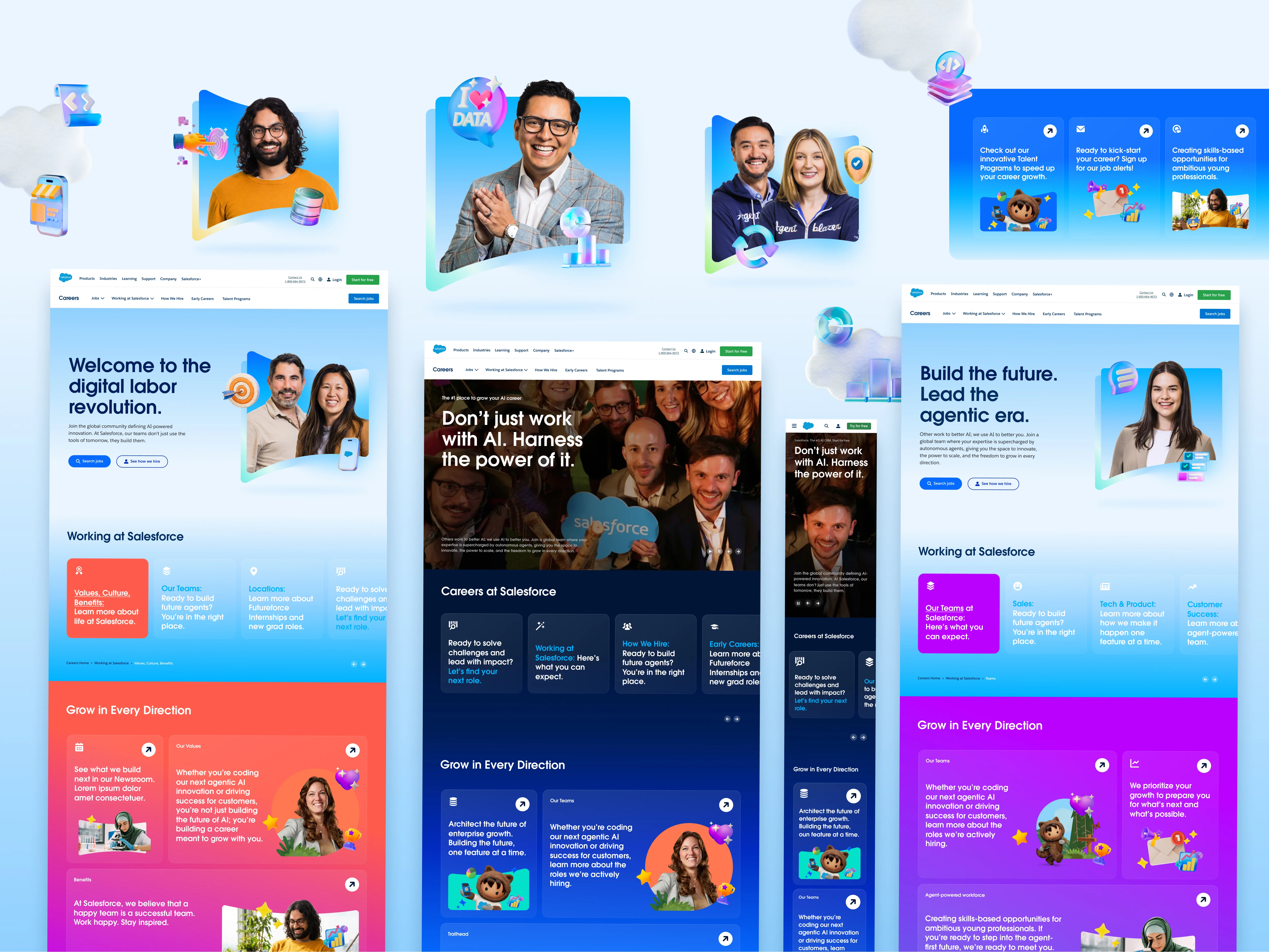
🤔 Reimagining a fragmented enterprise careers experience
Salesforce Careers had evolved over time across multiple teams, resulting in increasingly fragmented navigation, inconsistent page structures, and disconnected content experiences. The challenge extended far beyond redesigning individual pages—it required establishing a scalable foundation that could simplify information architecture, improve content discoverability, strengthen employer branding, and support future growth while working within the constraints of an existing enterprise platform.
I focused on building a connected design foundation where information architecture, visual language, modular systems, and implementation could evolve together. Through navigation exploration, lightweight user testing, reusable component and token libraries, tailored visual systems, and production-ready blade prototypes built directly within Salesforce's enterprise Page Builder, the work aimed to create a more flexible, scalable, and collaborative platform for future careers experiences.
I started by understanding how candidates actually navigate a careers website.
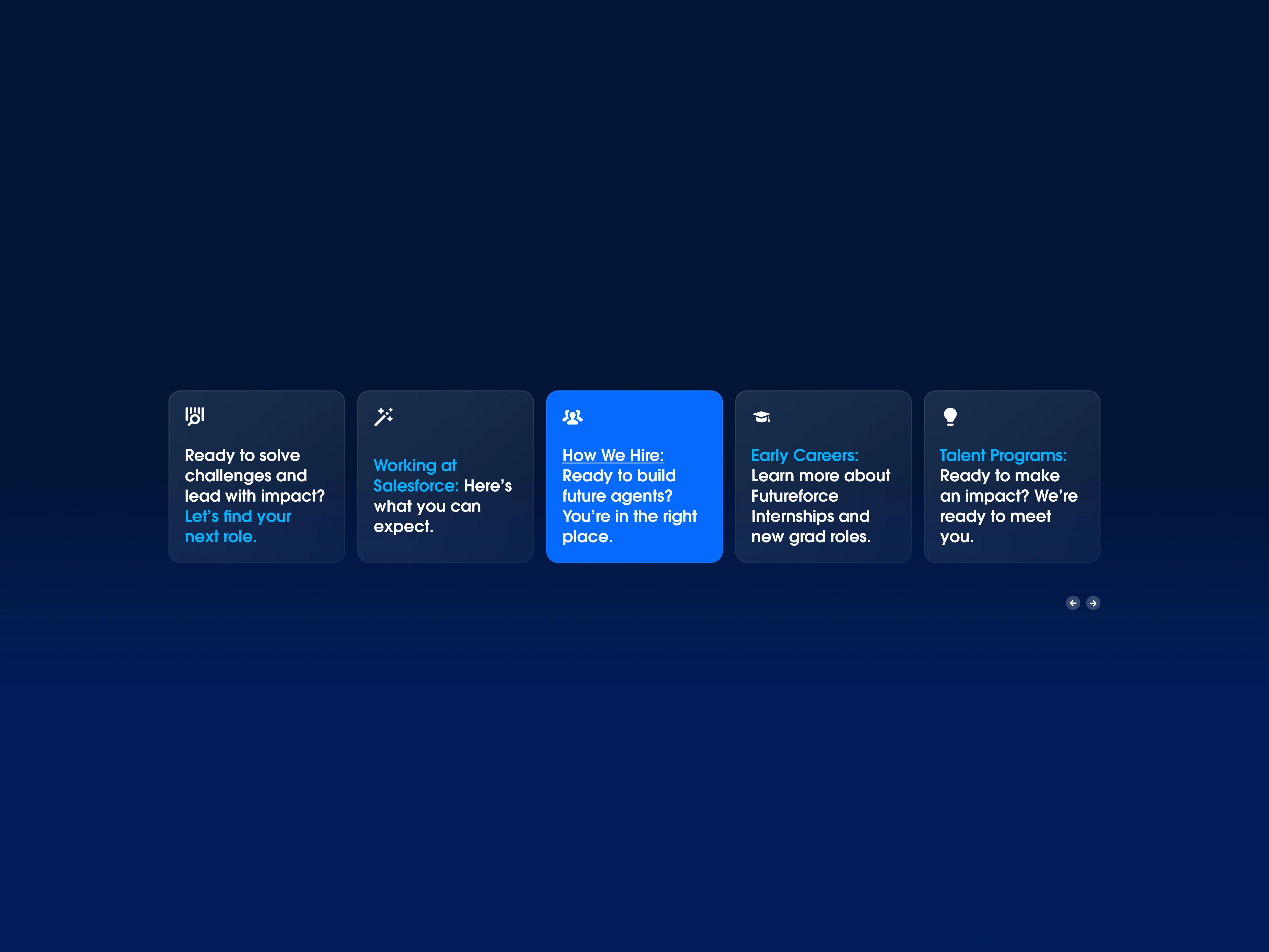
The existing experience relied heavily on nested navigation, making it difficult to discover content, particularly on mobile devices. Instead of simply reorganizing menu items, I explored how navigation and on-page wayfinding could work together to create a more intuitive candidate journey.
Through competitor research, information architecture exploration, and lightweight usability testing, multiple navigation models were evaluated before arriving at a leaner approach that reduce reliance on dropdown menus while surfacing richer content directly within pages.
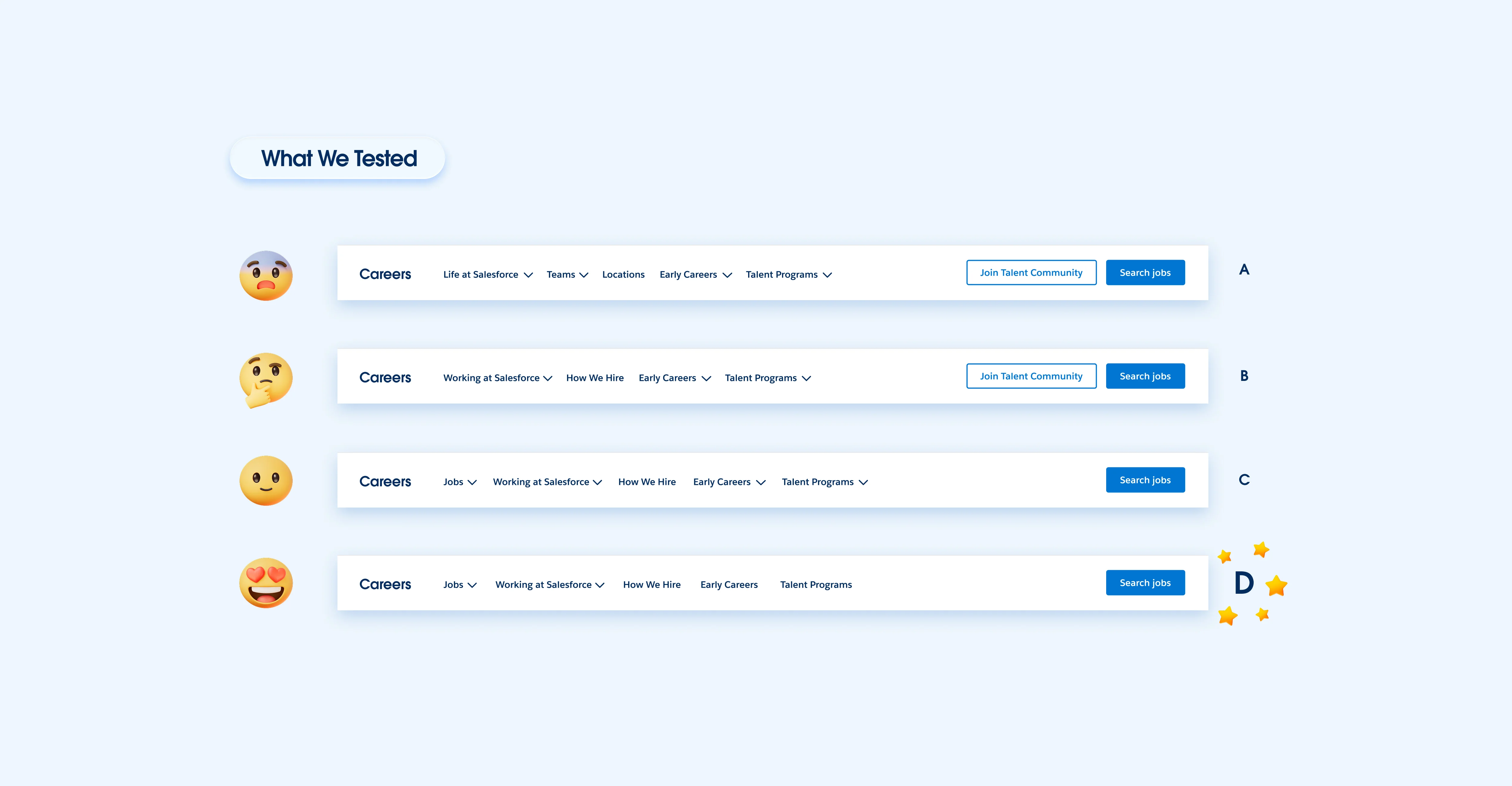
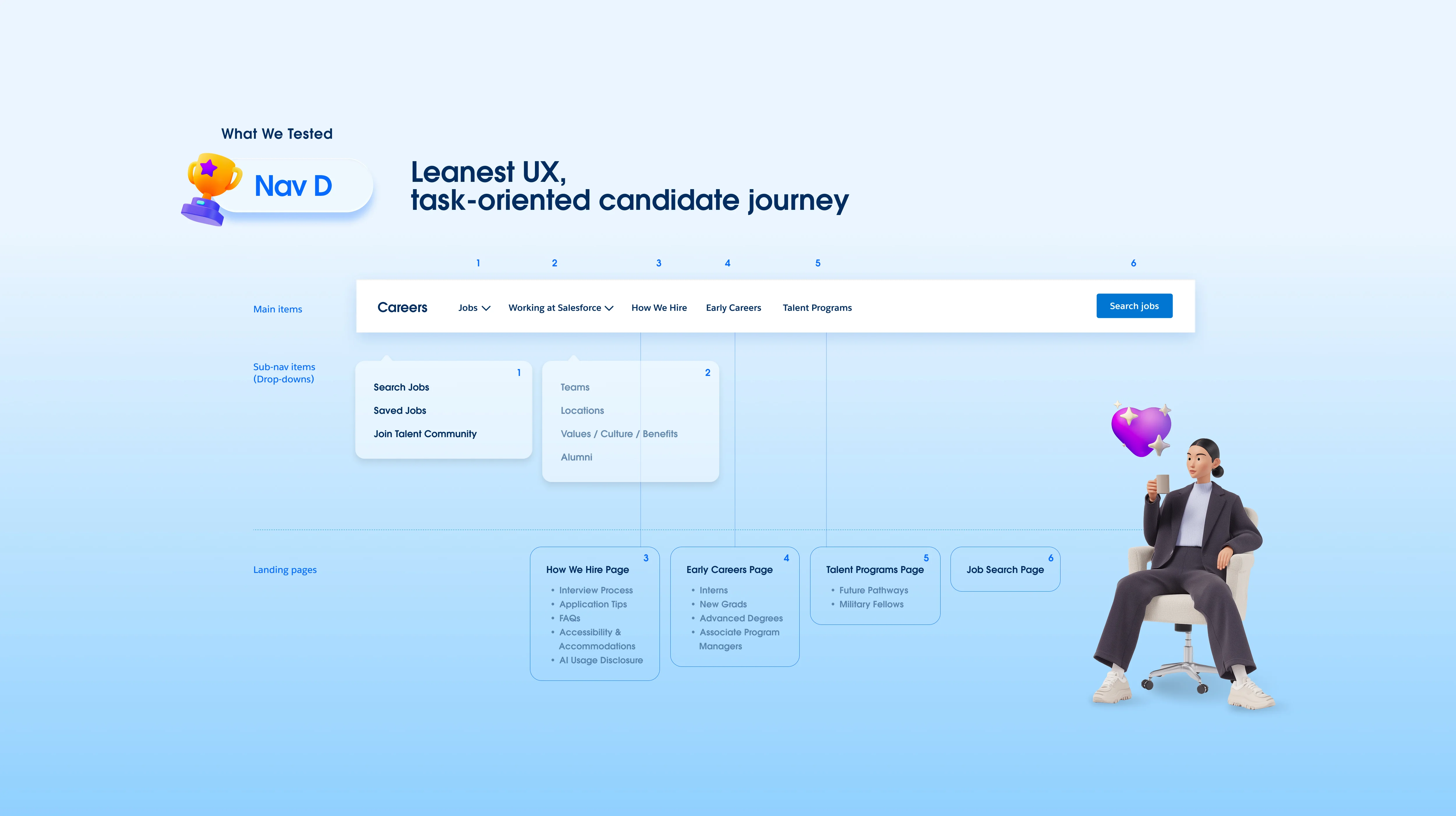

Navigation D utilizes progressive disclosure strategy. It focuses on the initial choices and eliminates excessive drop-downs. Users will get more relevant choices that match their intents from 'On-Page navigation cards' throughout the pages. It also organizes the items on the main nav bar, separating the 'Why' and the 'How', grouped the why 'Working at Salesforce' items together, while prioritizing 'How We Hire'.
Rather than designing isolated pages, I focused on creating a modular content system from scratch, they are capable of supporting a wide range of editorial and recruiting needs.
Modular cards, flexible layouts, and scalable design tokens allowed new pages to be assembled efficiently while maintaining visual consistency across the experience.
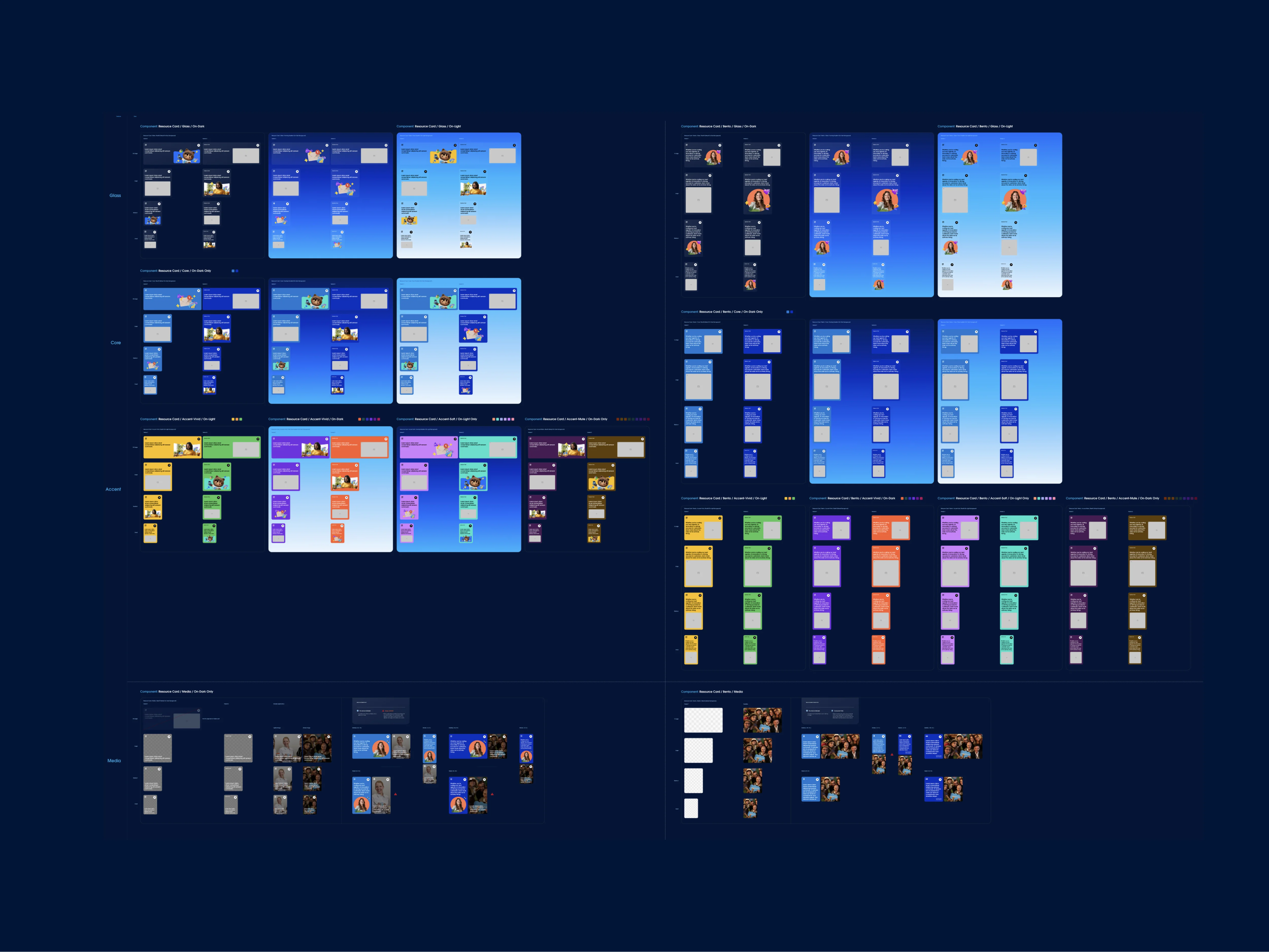

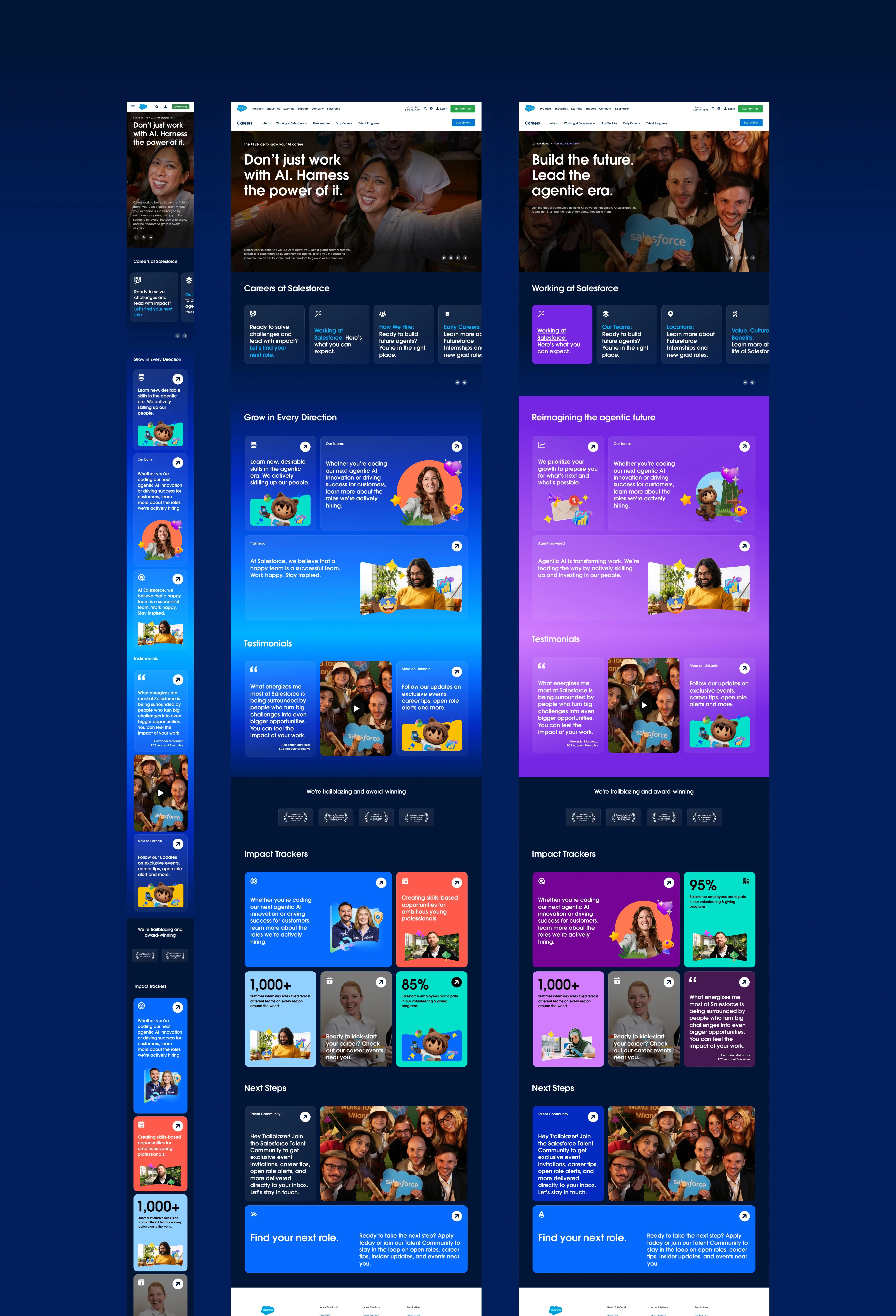

Both light and immersive visual directions were explored to support varying storytelling needs—from editorial content and employer branding to job discovery and recruitment campaigns, while remaining aligned with Salesforce's evolving brand language.
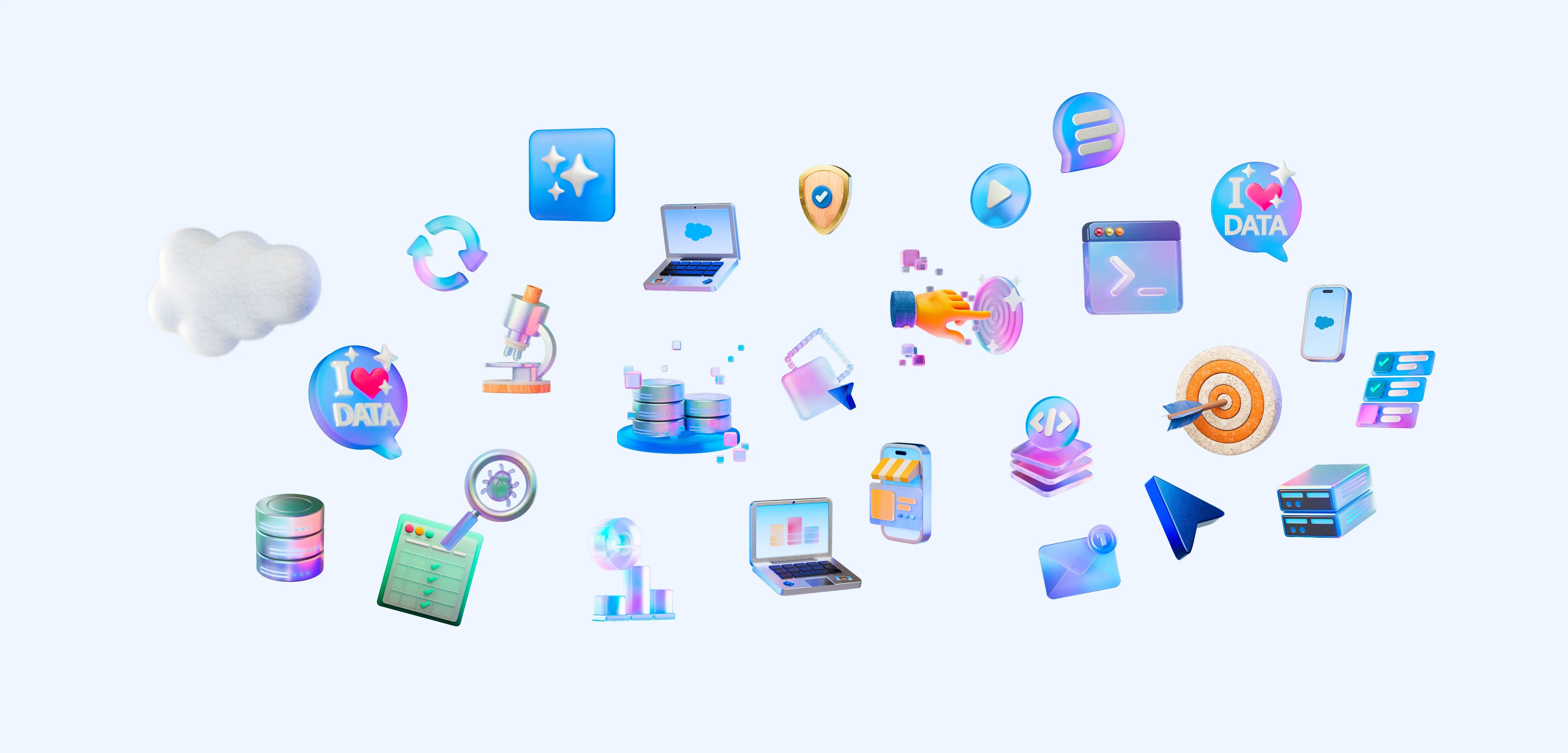
Beyond navigation and component system, I developed a visual language tailored specifically for Salesforce Careers. By combining Salesforce's evolving brand direction in editorial style with modular layouts, expressive gradients, custom 3D storytelling icons and framing devices, the system created a more engaging and flexible foundation for employer branding across different candidate journeys.

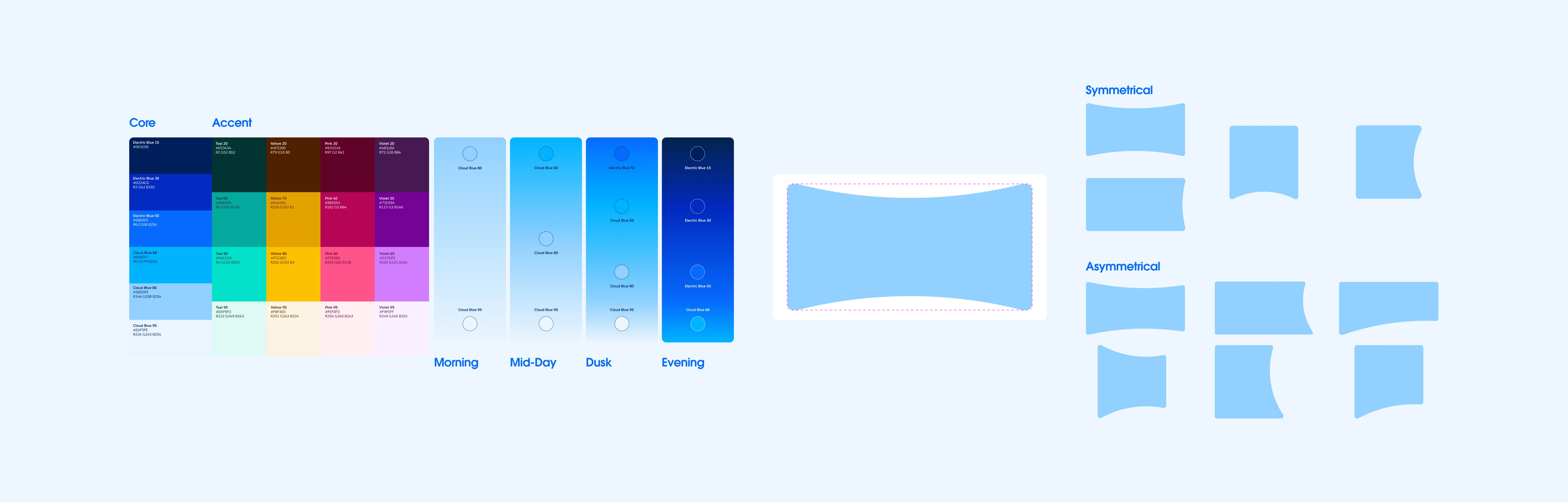
Rather than stopping at prototypes, I translated key components into production-ready blades, using HTML, CSS, and lightweight JavaScript directly inside Salesforce's enterprise Page Builder.
This enabled realistic interaction testing, responsive behavior validation, and faster conversations with stakeholders and engineers.

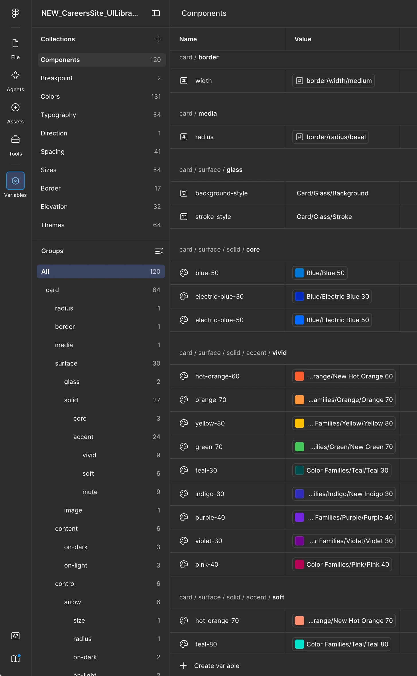

The token library that I built from scratch, creates a shared system across design to implementation and set a strong foundation for future scaling.
🎯 Instead of measuring success by a single launch, this project focused on establishing a system and stronger foundation for future growth.
By connecting navigation strategy, modular systems, visual storytelling, and production-ready implementation, the work creates a more scalable direction for Salesforce Careers—one that can continue evolving alongside changing content, business priorities, and candidate expectations.
My role
Visual Systems, Design Systems, Information Architecture, UX Strategy, UI Design, Rapid Prototyping, User-Testing, Component/Token Libraries, Front-end Implementation
Tools






Created for
Website
Timeframe